Bringing Webpages / Social Media / and Design Systems to life.
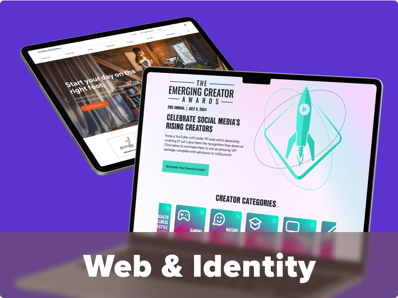
Web & Identity
<span data-metadata=""><span data-buffer="">Bringing Webpages and brand identity to life from concept to finish.
Crafting Unique Designs
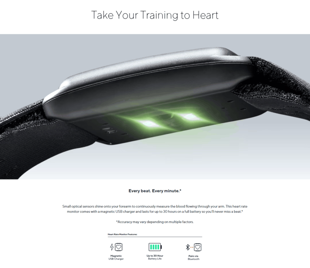
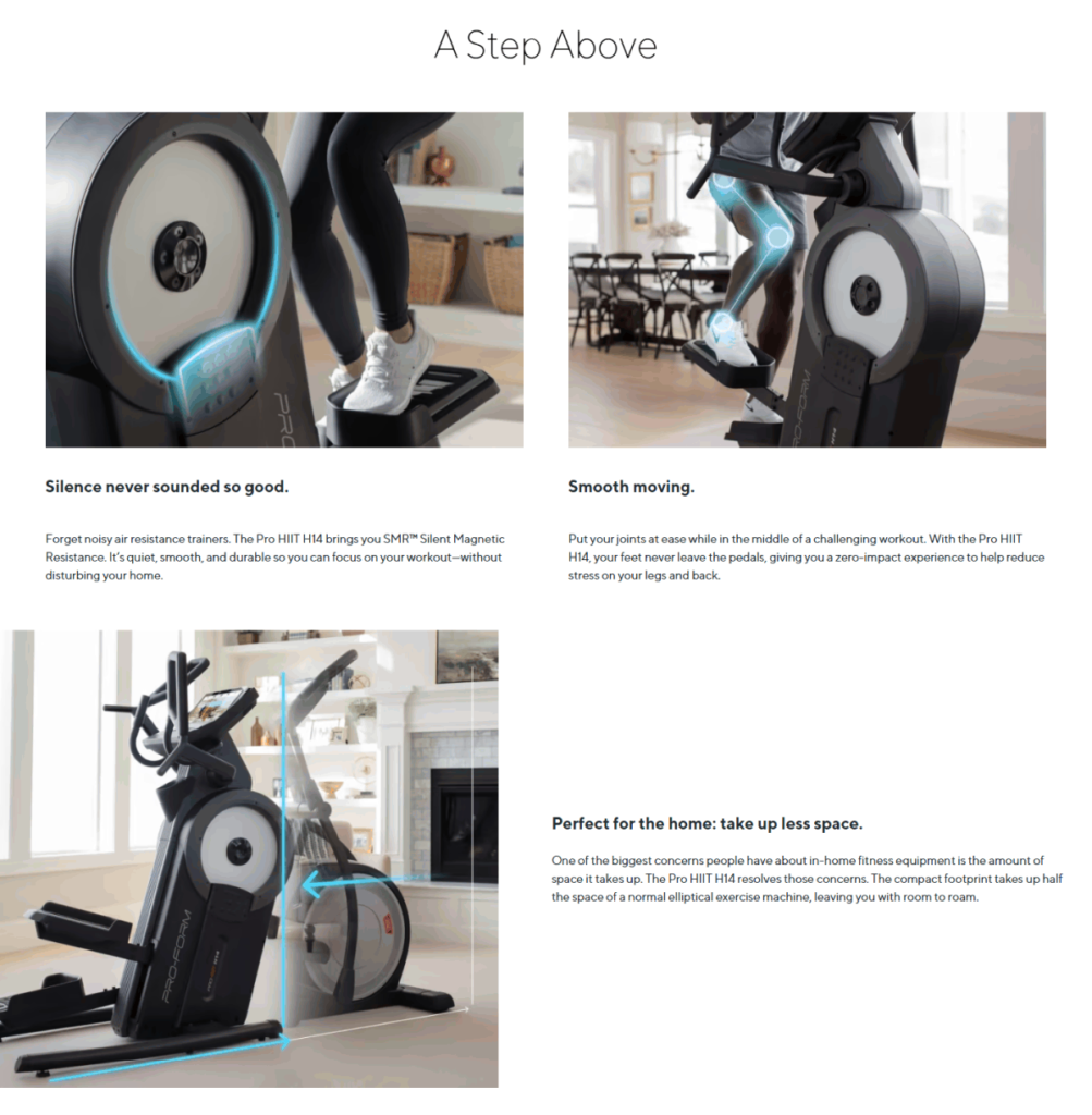
The design journey begins with conceptualization. I immerse myself in the brand’s essence with our team, to make sure we understand its mission, values, and target audience. The design should not only look visually appealing but also align seamlessly with the brand’s narrative. Whether it’s a product detail page for an ecommerce page, a SAAS website, or a campaign landing page, I strive for best principles that sets our work apart through static imagery and motion website visuals.
Staying True to Branding
Adhering to established guidelines means that the Design System must match the brand’s voice so that we can scale our design efforts—and is also ADA compliant.
Building the Brand & Design System
Who this is for:
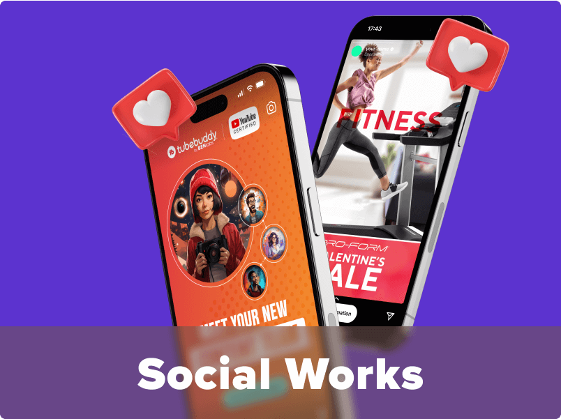
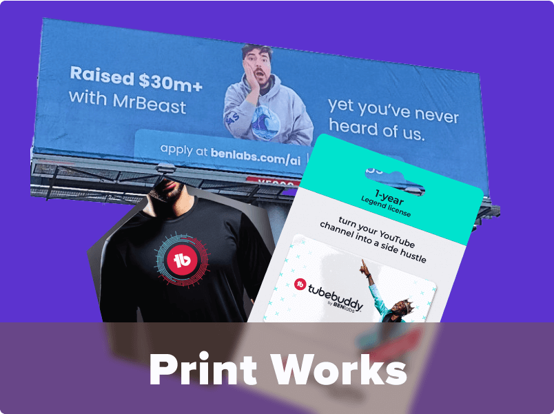
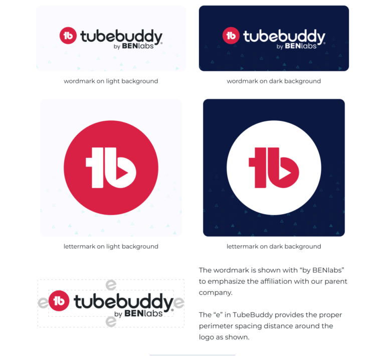
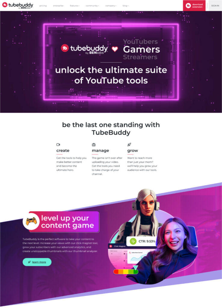
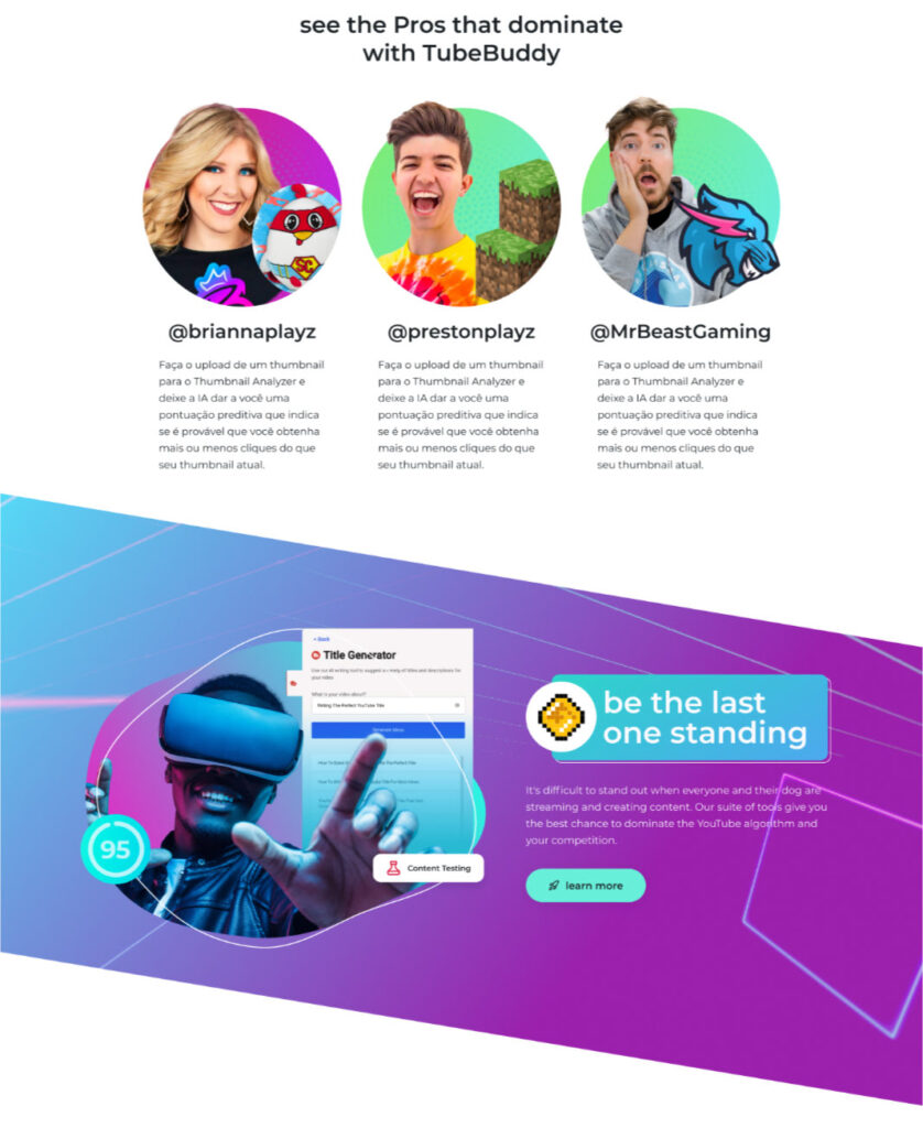
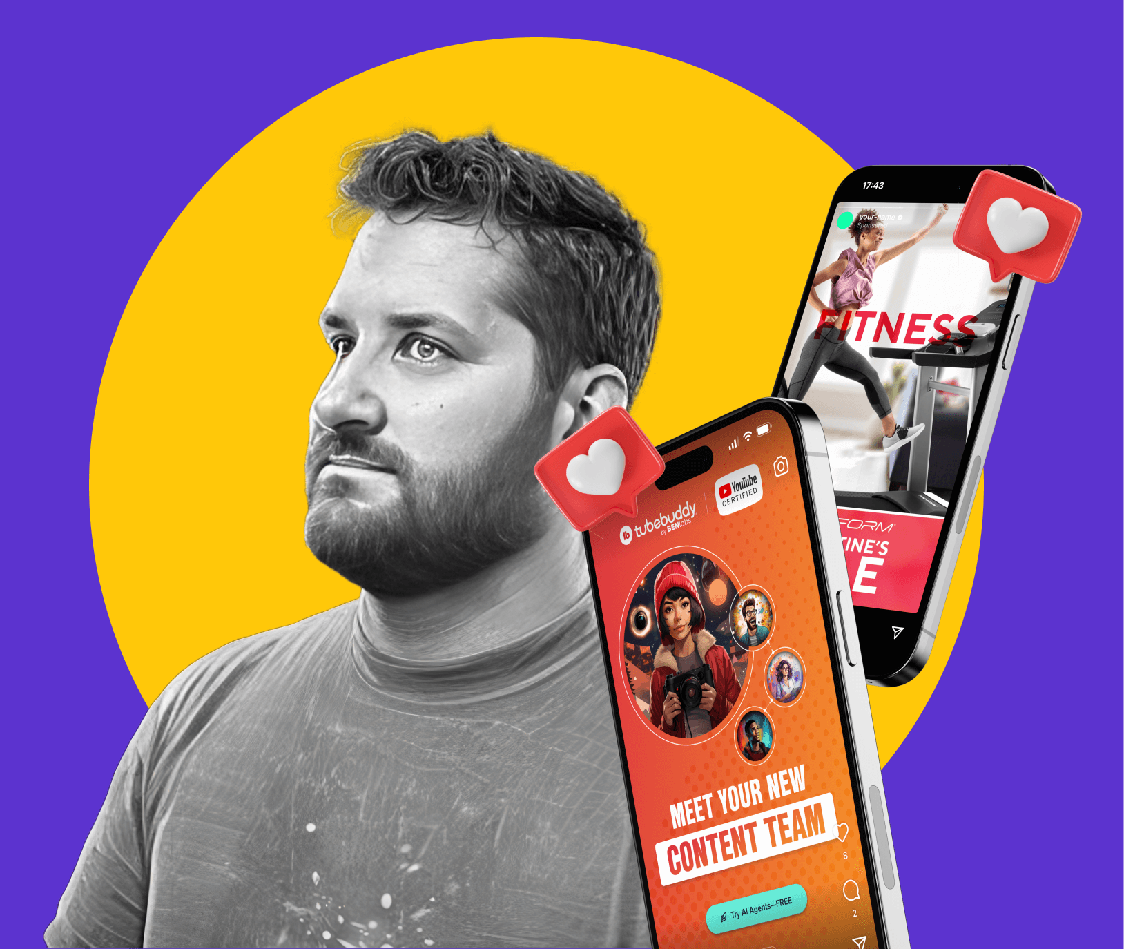
TubeBuddy – BENlabs
What was delivered:
Brand identity
Design system
Brand strategy
As I came on board to TubeBuddy’s team, it required that a new website was built and a new visual strategy was designed. Using current colors and modules that were ADA compliant was a challenge, but we were able to build that for the website which translated to the TubeBuddy web app that was built by a separate development team.
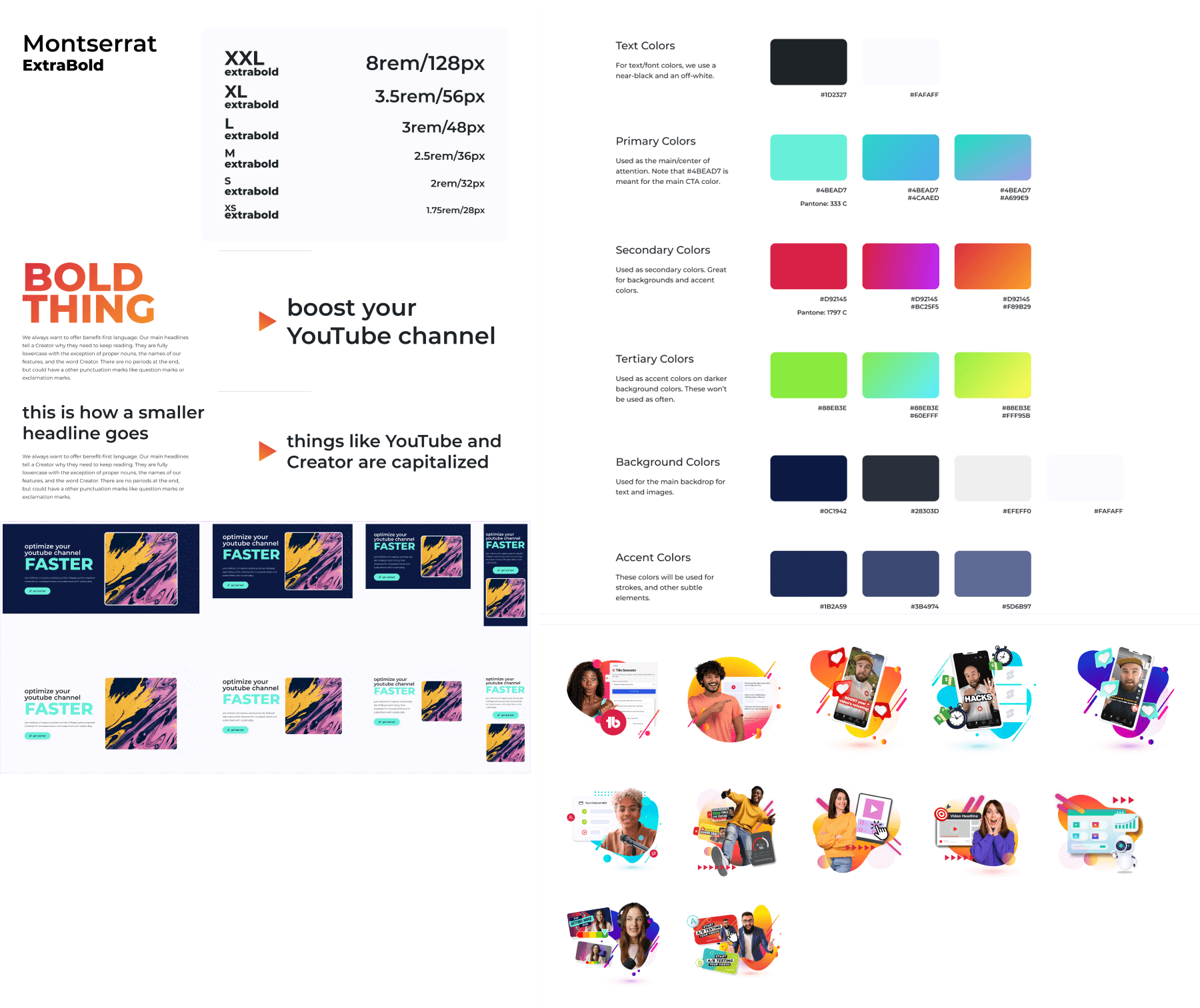
Building an atomic design system was an important foundational process. It guides all who build TubeBuddy to use consistent colors, typography, and styles. This is true for app teams, sales teams, and the marketing team.
A new TubeBuddy logo needed to be designed to modernize the brand while keeping the logo mark to stay recognizable to YouTube.
Imagery was inspired by modern Neo Memphis, and the bold choice of Montserrat allowed for text to be relatable as well as bold when needed.
Approved modules created from the design system allowed to build new pages, landing pages, and even emails quickly and efficiently.
A vignette of some of the design system of the font sizes, colors, and graphical elements.
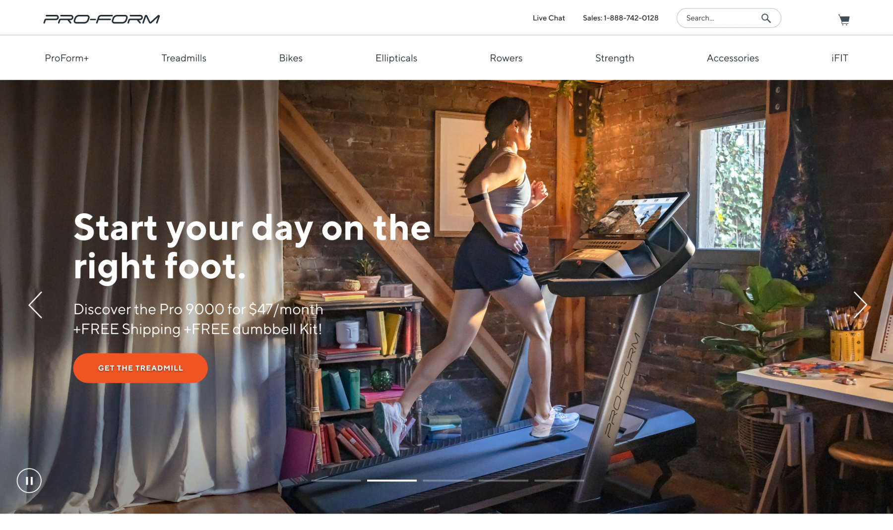
ProForm Design System + Website
Who this is for:
ProForm (ICON Health & Fitness) – iFIT
What was delivered:
Brand identity
Design system
Brand strategy
Working as an in-house designer for ICON Health & Fitness (later rebranded as iFIT) offered some great experiences to create visual assets from start to finish. From creating shot lists to work with an in-house Photographer to art directing the shoot. We would then use the assets created from the photo and video shoots to create product detail pages and other pages for proform.com
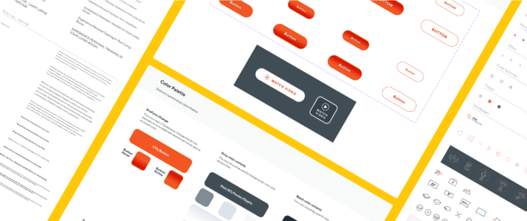
The design system for ProForm became the backbone for all of our visual assets for the website and guided print collateral for box art, hanging tags for products in retail stores, and catalogs.
Housing all of our icons, colors, and design modules for our websites. It made it quick to build new pages based off of our pre-approved designs.
A vignette of some of the design system of the font sizes, colors, and graphical elements.